
 Limit Text Colors and Fonts")
Continuing Best Church Websites Month, nothing makes church websites more cringe-worth than using a bunch of different text colors and fonts.
Here’s an example:
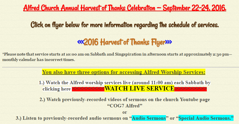
Yikes!
The web administrator is probably thinking… “If I use a different, bright color for each item on the page, it will stand out and get people’s attention.” Yes, and so will wearing a power-blue tux to church.
Consider this: if you feel the need to make certain parts of a web page stand out, then it probably means you have too much on the page.
Instead of using color to make certain text stand out from the rest of the page, reduce the amount of text it needs to stand out from.
Another reason I’ve heard web administrators give for using multiple fonts and text colors is because they think one color and one font makes their website look boring.
Our advice: if you think a web page looks boring, add a quality image to it.
As we discussed previously, the human brain is wired for images. A good website engages its visitors with good images.
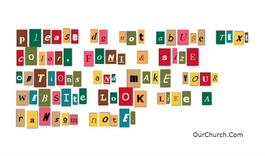
Please do not abuse text color, font & size options and make your website look like a ransom note.
How Text Colors and Fonts Affect SEO
Limiting text colors and fonts is not just a web design issue but also an SEO issue. Getting links to your website and social shares are important for improving search rankings and increasing website visitors. People are much more likely to link to and share a good looking website than one that looks like a ransom note. That’s why we say… If You Want Better Search Rankings? Start with This 10-point Checklist
Comment & Discuss
- Is one color of text (plus a color for links) enough?
- Are there good reasons to use additional colors?
Read other posts in this series…
6) Have Imagery Above the Fold << Best Church Websites 8) Are Easy to Read