
Often the appearance of a website says more about your organizations than the text you put on it. Images of people on the site make the organization seem people-friendly. Straight text makes an organization look boring. Color schemes can make a site look feminine, masculine, childish, hip, or mainstream.
One of the best music concerts that I’ve been to was at a Steven Curtis Chapman concert. The stage was filled with smoke, colored lights, lasers that cast different shapes on the walls and floor, and a setup in which every instrument and singer had their own little area. The drums were placed up high. The keyboard and organ were to the right in a booth. The bass guitarist was to the left in front of his mega amp (which was taller than he was). You get the picture. It was awesome! I went there expecting to just listen to the music, but I not only listened, but I “experienced” the music.
Later on, I saw Steven Curtis Chapman and his band on TV. It was a small setup, but it seems to be the same band, same vocalists and same songs. Something was missing though. It was good, but I just didn’t enjoy it as much.
A website is a lot like a concert in this way. Your content can be great, but if you dress it up with a great design and features, it can be memorable!
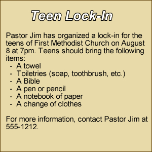
Here is a small example of an announcement for a teen lock-in. I used basic text with a little color for the background and border. This can basically be done with HTML code and it looks good. It delivers all the info that it needs to:
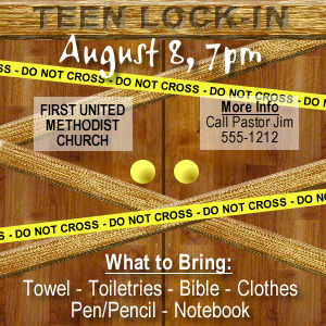
Now, here is the same message with a little more design to it. It was created with a graphics editor, but it is the same size and delivers the same message. However, the design is much more appealing and fun to look at. It also conveys the feeling that the teens are going to have fun as well:
These are examples of “small-scale” things you can do with design. You can use the same theory with an entire website. A floral company might decide to design their site with several flowers surrounding the content of the site and use light colors to complement. A lumber company, might have the appearance of their company logo engraved in a log. A church may use images of their congregation worshipping or a group of friends laughing to give an image that their church is comfortable and for everyone.
There are millions of creative ways to convey a message or feeling through design. Just remember, when it comes to words, a picture is worth a thousand of them.
If you found this article interesting, vote for it on Blogs4God so others will see it as well!
6 Comments
Do we have access to a "graphics editor" for our website? If so, how about directions?
Rose,
A graphics editor is a usually program that installed on your computer, like PhotoShop or Paint. Some are advanced, others are very simple.
I can recommend one that is OpenSource (meaning free) that is called GIMP. You can download it at http://www.gimp.org/
It is an advance graphics editor that may take some getting used to, but it is excellent!
I hope that helps.
Gimp looks great but how do I insert it into the website?
Randy,
GIMP is a piece of software to install on your computer. It allows you to create and edit graphics on your computer. You can then upload those graphics to your site to use.
Excellent article Mike. Many churches have so much to learn about helping people experience their sites. More and more, people moving to new cities who are looking for churches are doing their initial research online. If a church's web site does not represent them well, many people will just dismiss taht church and move on to one that is better represented online.
GOD BLESS YOU INDEED.